
Branding for a sustainable cleaning brand that makes cleaning, cleaner.
This notional company combines two things I love, sustainability and cleaning. The name stemmed from brainstorming a list of words about
what cleaning could mean to different people and I landed at the word control, taking the reigns.
what cleaning could mean to different people and I landed at the word control, taking the reigns.
Reign plays on the word rain, the naturally occurring cleaner of the world.
ORIGINAL SKETCHES AND IDEATION

click to enlarge

click to enlarge

click to enlarge

click to enlarge
original ideation


These are my original computer iterations.
After receiving feedback from my peers and professors,
I decided that none of these were correctly communicating
my brand message to the audience.
I decided that none of these were correctly communicating
my brand message to the audience.
Back to the drawing board I went.
First Round (click to enlarge)
FINAL BRANDING

Brand Guidelines

For my mockups of the brand, I created a subscription box, essential oil to put in non-scented cleaners, and kraft pouch bags for dissolvable cleaning tablets.
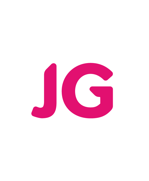
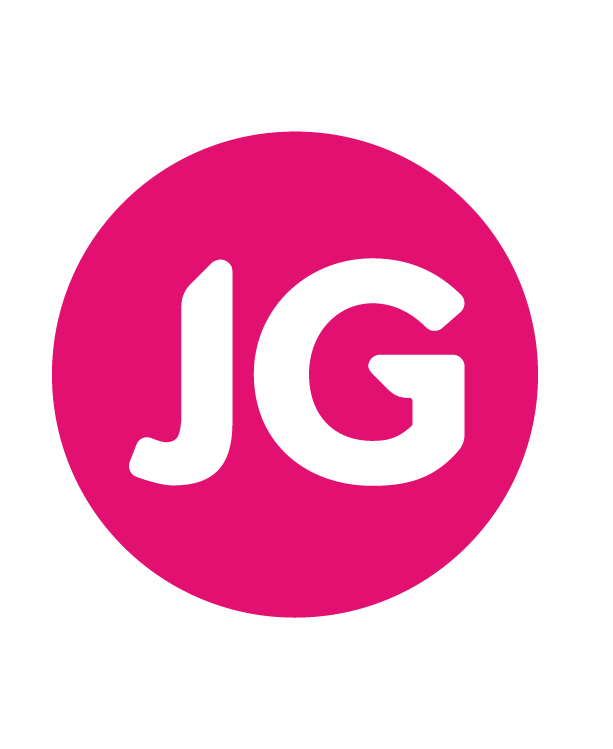
This brand needs to feel approachable, organic, and clean.
To meet this goal, I designed a simple logotype that included
organic line weights and natural curves.
To meet this goal, I designed a simple logotype that included
organic line weights and natural curves.
The brand needed to feel clean and simple so I chose a matching
color palette, blue and white.
color palette, blue and white.
I added yellow as a product brand color to make it pop in stores.

click to enlarge

click to enlarge

click to enlarge
Final Applications


